
Using AI to Find Your Hidden Influencers
Mar 22, 2026Written by Ed Cook and Roxanne Brown
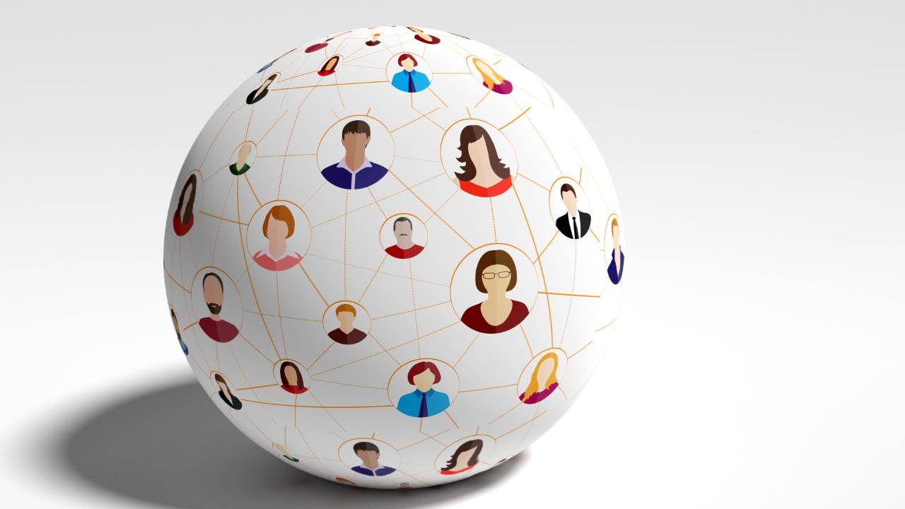
The organizational chart is a map. Often an incomplete map, but a useful one nonetheless. It clarifies reporting lines, defines accountability, and gives a framework for decision ownership. But it only tells you who reports to whom. It does not tell you who listens to whom. For a change leader trying to understand how a new process, system, or strategy is actually rippling through an organization, the difference between those two things is the difference between navigating by a map and navigating by a GPS app. Think of all the rich data the GPS app provides, such as accidents, traffic slowdowns, and objects in the road. It is more than the map. It reveals the hidden obstacles and obscured shortcuts between you and your destination.
Most change efforts rely on the org chart and traditional sentiment surveys to gauge adoption. These are useful, but incomplete. A survey tells you that 68% of respondents feel "somewhat prepared" for the change. It does not tell you that one quiet team manager in operations is the individual that 40 people across four departments go to when they have a question about how work actually gets done. If that person is skeptical of the change, your 68% readiness score does not tell you there may be trouble ahead. If that person is an advocate, your change has a guide with an insider's view of what people really think.
To find that person, you have to map the network. You have to find the hidden influencers.
The Single Question
The instinct when measuring anything in an organization is to build a comprehensive survey. More questions, more data, better insight. We have argued throughout this series that this instinct is often wrong. It is the "minimum set" of data, chosen with careful thought, that outperforms the kitchen sink every time. Network analysis is a dramatic proof of that principle. You do not need a 50-question survey to map a social network. You need one question:
"Who do you go to for help when you have a question about your work?"
That question, asked of every member of a team or department, produces a dataset of extraordinary insight. Have each person list the individuals they turn to and assign a strength score, 10 for someone they rely on heavily, 5 for an occasional connection, and 0 for no relationship. People can fill in the nuances between those three values with those guideposts established. What you now have is not an opinion poll. It is a structural map of how information and influence actually flow through your organization.
The simplicity of this is deceptive. A single well-formed question, as we discussed in Start with a Question or Hypothesis, can direct an entire analytical effort. This question, about who people go for help, directs you toward the social architecture of your change, something the org chart was never designed to reveal.
There is even deeper value in that one question because it is fundamentally a question about Trust, which we define as “the willingness to risk being dependent on others for my personal success.” A person who names someone in that survey is declaring a dependency on that person. Trust is one of the 10 Dimensions of Joy at Work. Exhibiting the willingness to be dependent grows Joy at Work.
Two Numbers That Matter
Once you have the data, two statistics from network theory do most of the analytical work for a change leader. Neither requires a degree in mathematics to understand or to act upon.
The first is In-Degree. This is simply the count of how many people named a specific individual as someone they go to for help. A person with a high in-degree is someone the organization has already elevated, even if that elevation is not indicated on the org chart. People seek them out. They are trusted. They have influence not because of their title, but because of their relationships. It is similar to someone on social media who has a group of avid followers. In a change context, these are the people whose opinion of the new system or process will quietly shape the opinions of dozens of others.
The second is Betweenness Centrality. This metric identifies people who serve as bridges, the connectors between groups that would otherwise be isolated. Think of two departments that rarely interact. If only one person in Procurement has relationships in both Engineering and Finance, that person is a bridge. Remove them (or fail to engage them), and information about the change stops flowing between those groups. Betweenness Centrality quantifies this bridging role. A person with high betweenness may not be the most popular individual in the network, but they are the one whose absence divides it.
These two metrics, applied to the data from a single question, will tell you more about the true social structure of your change than a dozen town halls and a shelf of survey reports.
What a Tighter Network Actually Does
Ed teaches analytics and statistics at a university. At the start of every semester, he asks my students a version of the same network question: "Who do you communicate with in this class?" The answers in the first week are predictable. Most students list zero connections. A few know one or two people from a prior course. The network, visualized, looks like a scattering of isolated dots with almost no lines between them.
Ed uses that data. For group work, he pairs students who have no connections. He does this not to increase their social bonds but because the research is unambiguous: tighter networks produce better outcomes.
By the end of the semester, the class network looks entirely different. The isolated dots have become a meshed web. Students communicate more easily. They seek help from people they did not know four months earlier. And here is the result that matters: grades go up. Not because the content became easier. Not because Ed lowered the standard. The students perform better because they are connected, because when they struggle with a concept, they have people to turn to, and when they understand something well, they are in a position to teach it. The network itself becomes a tool to improve learning.
When Ed tightens the network, he is not just connecting dots on a chart. He is creating conditions for Belonging (the willingness to be part of the group) and Cohesion (the willingness to work as a united force). It is not just the students who must be willing. Ed, as a representative of the organization, must make the invitation to the students to exhibit the 10 Dimensions of Joy at Work.
The business translation is direct. When a change leader understands the true social structure of a team or department, they can intentionally design interactions that tighten the network. Cross-functional meetings that pair disconnected groups. Offsites that seat people next to colleagues they have never worked with. Pilot programs that place a bridge connector on the team precisely because of their ability to carry information back to an isolated group. These are not random acts of team-building. They are informed, structural interventions.
This connects to something deeper than change management. Tightening a network reduces isolation. It builds competence by connecting people who need help with people who can provide it. It creates the conditions under which trust develops, not through speeches or posters about values, but through repeated, genuine interaction. These are the conditions that grow Joy at Work.
Using an LLM to Do the Heavy Lifting
In the past, running network analysis required specialized software, like NodeXL, an add-on for Excel that could calculate centrality metrics and generate network visualizations. These tools worked, but they came with a significant barrier in that technical knowledge and practice were required to operate them. This discouraged use. The result was that network analysis remained the domain of academics and data scientists, locked away from the people who would benefit from it most. That barrier is gone.
Today, you can take that simple spreadsheet and upload it directly into a Large Language Model like Claude or Gemini. As we described in If You Can Conceive of It, You Can Calculate It, you do not need to know how to code. You ask plain-language questions. The LLM writes the code behind the scenes, executes the analysis, and gives you a clear, written answer.
The prompts are remarkably straightforward:
"Calculate the in-degree and betweenness centrality for each person in this network."
"Who are the top three influencers based on how many people seek them out for help?"
"Which two people, if connected, would most tighten this network?"
That last question is the one that would have taken hours of manual analysis or a graduate student with a background in graph theory. The LLM answers it in seconds. Not only does it identify the structural gap, but it can also explain why that gap matters. It can determine which groups are isolated, which information is not flowing, and the likely impact of the disconnection on your change effort.
As with every application of AI in our Data-Driven Change process, the critical caveat applies: the LLM does the calculating, but the human leader must do the thinking. The machine will hand you names. It is your responsibility to understand the context behind those names. Is the top influencer already engaged in the change? Bring them in closer. Are they skeptical? That is not a problem to manage. It is information to learn from. Their skepticism may be pointing to something your change plan has missed. Remember one of our Core Four Philosophies:
Everyone's point of view is valid, even if I disagree or don't understand it.
And as always, before you upload any data, protect your people. Anonymize the spreadsheet. Replace names with respondent codes. Strip out any personally identifiable information. The trust your colleagues placed in you when they answered that single question is not something to handle carelessly. Respect the data because it represents the people who gave it to you.
From Hidden to Engaged
The organizational chart tells you who has authority. The network map tells you who has influence. But there is a third thing the map reveals, and it may be the most important: who has been left out.
Every isolated node on the periphery of a network is a person who may have the capability and the desire to contribute but lacks the connections that make contribution possible. They are not unwilling. They are uninvited. Consider the framework of the 10 Dimensions of Joy at Work, an uninvited person cannot develop the Trust, Belonging, or Cohesion that the 10 Dimensions of Joy at Work describe because every one of those Dimensions begins with the word willingness, and willingness requires an opportunity to act.
The hidden influencer already has that opportunity. They have built Belonging by investing in the team rather than just the task. The network map makes their contribution visible, and engaging them in the change is an act of Respect, recognizing the unique value they have already demonstrated. But the hidden power of network analysis is not in finding the people who are already connected. It is in seeing the people who are not. Once the LLM hands you the map, the question shifts from "Who are my influencers?" to "Who have we failed to reach?" That second question is harder and may be more important.
Extend the invitation. Connect the disconnected. Create the conditions through intentional pairings, cross-functional work, and structured interaction under which Trust and Belonging can develop.
Joy at Work is not a program to be rolled out. It is a set of conditions to be cultivated. The network map shows you where those conditions exist and where they do not. What you do with that knowledge is the measure of your leadership.
